Examples of widget creation - advanced widget
Total traffic Bytes 15min - example assumption
We want to create a Widget that will show total traffic in the last 15 minutes on the chart.
Implementation
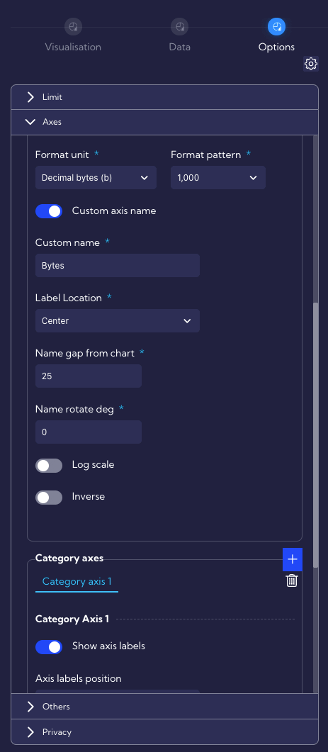
- Widgets are created and edited in the menu [Configuration > Widgets].
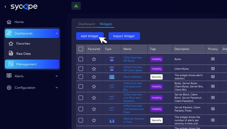
- To add a widget, click on the Add Widget button, then the widget wizard will appear.
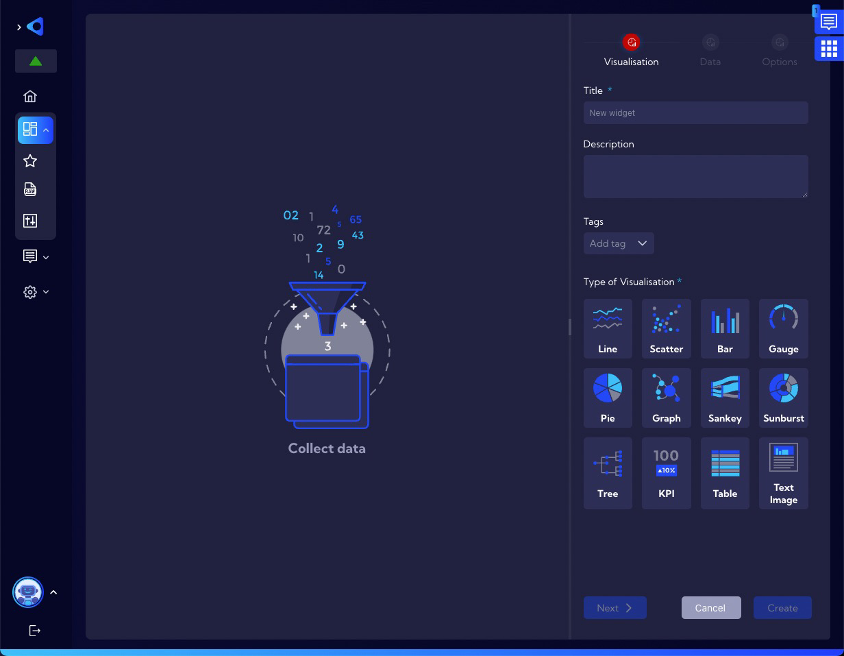
- In the Visualization Tab, enter the name of the Widget in the field Title. In addition to entering a name, you can enter a short description of the Widget in the field Description and assign Tags. Now it is necessary to select the type of visualization you want to use. In this example it will be Line.
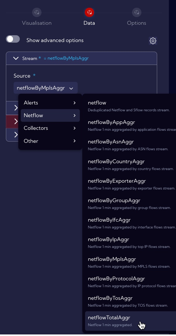
Change the tab to Data. The system marks with a maroon color and a triangle icon with an exclamation mark the sections in which it is necessary to complete the configuration. First, we need to choose the Data Stream that we will use to create the Widget - it must have, in this case, data on the amount of traffic in Bytes. In our case we can use one from two streams: netflow (Deduplicated Netflow and Sflow records stream or netflowTotalAggr (Netflow 1 min aggregated). In both cases the results will be the same, the only difference will be in the use of server resources - netflowTotalAggr is a stream already aggregated so the operations will require less resources and thus will be performed faster, so let's choose it.
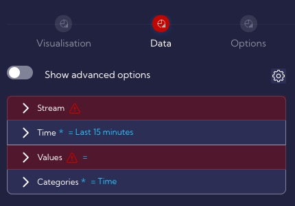
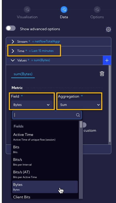
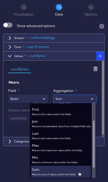
- Leave the time for which calculations are to be performed at Last 15 minutes. To calculate the total traffic per unit time, we need to select the Bytes field and Sum Aggregation to calculate sum bytes.
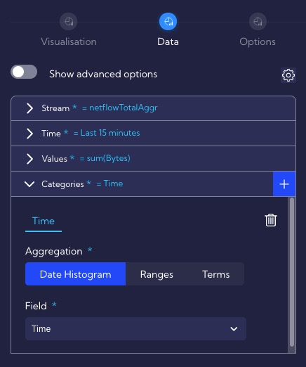
Leave the settings of the Categories section unchanged. Time value will be displayed on the X axis. At this point we get an overview appearance of the Widget.
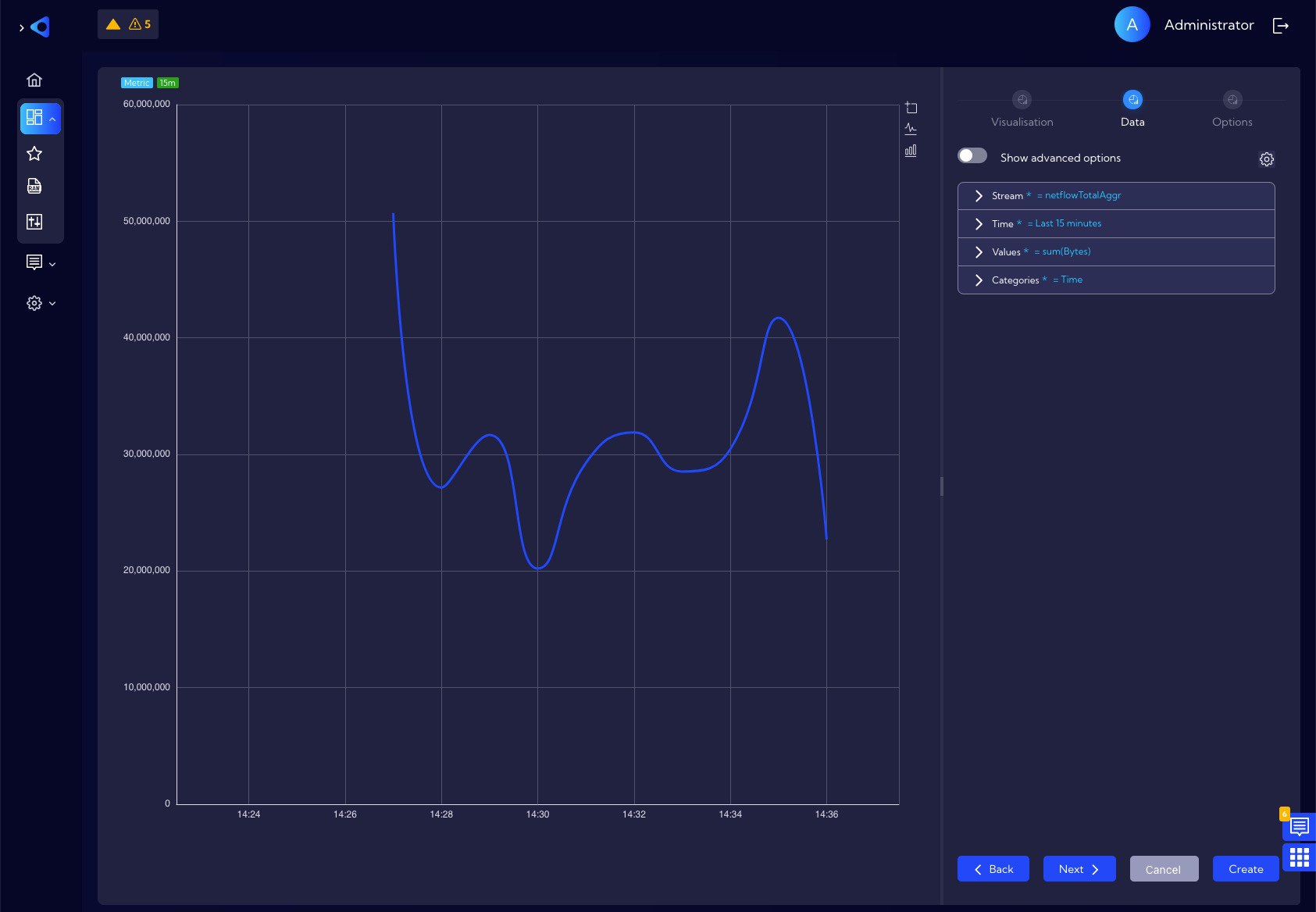
- At this point we can finish creating the widget by saving it with the Create button.
As you can see above the chart looks quite ascetic for example: no axis descriptions, values on the Y axis not user frendly, no legend. How to make a more custom chart is described in the section below - Visual tuning.
Our new Widget appears in the list of widgets and is ready to be used as part of the Dashboard.
Visual tuning
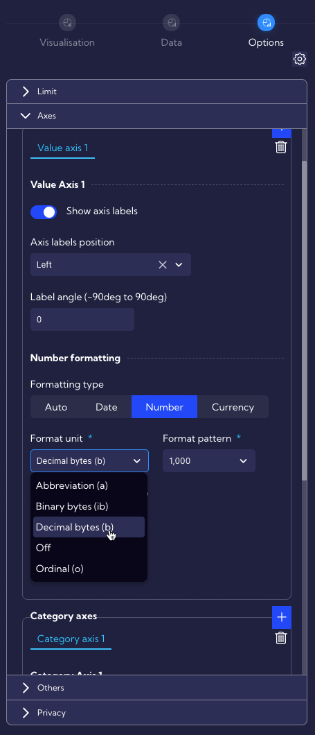
- Change the tab to the Options.
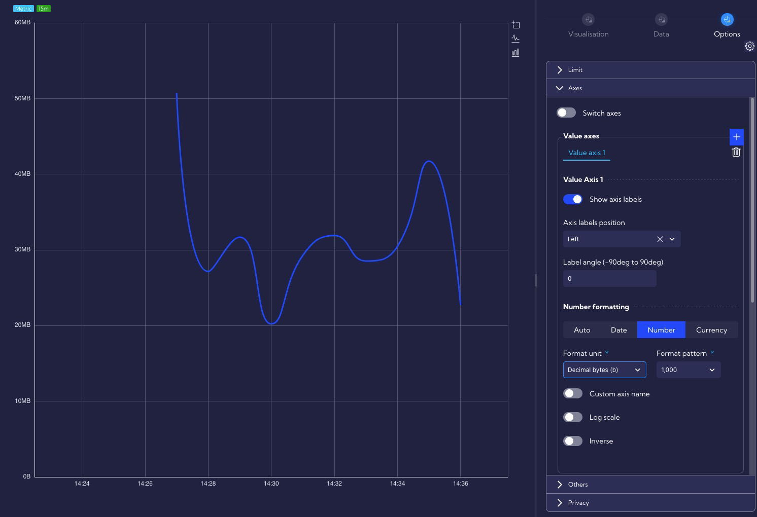
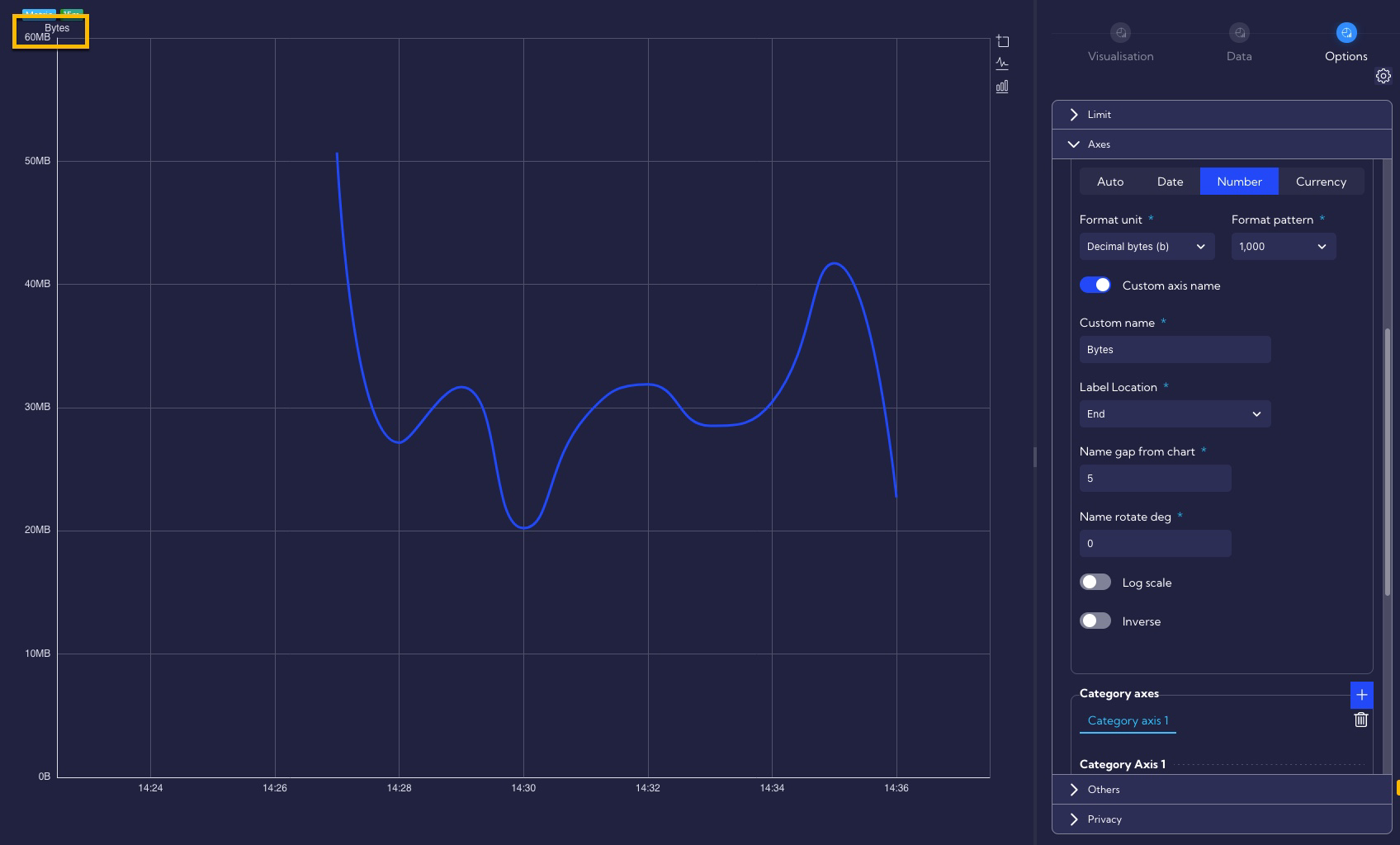
Let's change the formatting of the numbers on the Y-axis to a more friendly one - set the format unit to Decimal bytes (b).
You can see that the values on the Y axis now looks much better.
Let's add descriptions of axes.To do this, turn on the Custom axis name switch in Value Axis 1 section and enter the axis name in the Custom name field - in our example, we'll enter the word Bytes. In the Label Location field we can specify in which part of the Y axis the name will be displayed (Center, End, Start) - let's choose End. In the Name gap from chart field, we can specify the distance from the Y axis at which the label name will be displayed - let's enter a value of 5.
Now our chart looks like the one below.
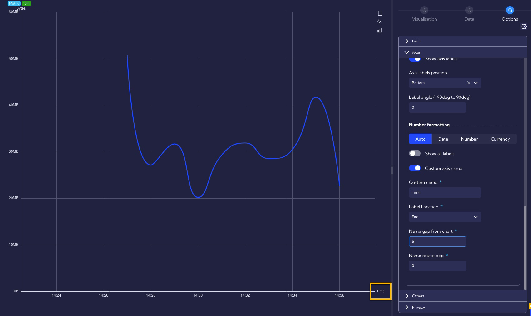
In the same way, let's add a description of the Category axes (X axis).
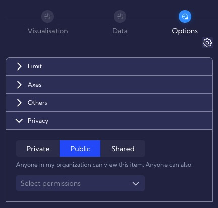
Changing widget permissions
Change the tab to the Options.
By default, the Widget has permission settings as Private.
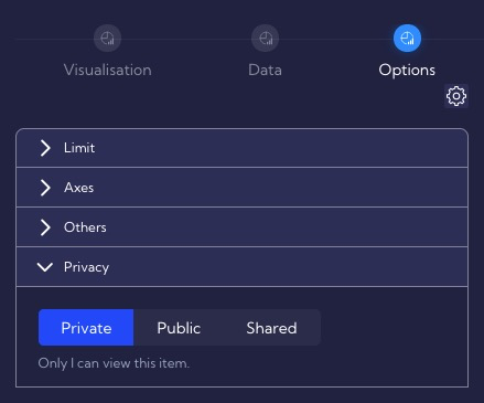
If you want other users to be able to use the Widget, change its permissions to Public.
Our new Widget appears in the list of widgets and is ready to be used as part of the Dashboard.